Charts Explain Reaction, Chains Explain Cause
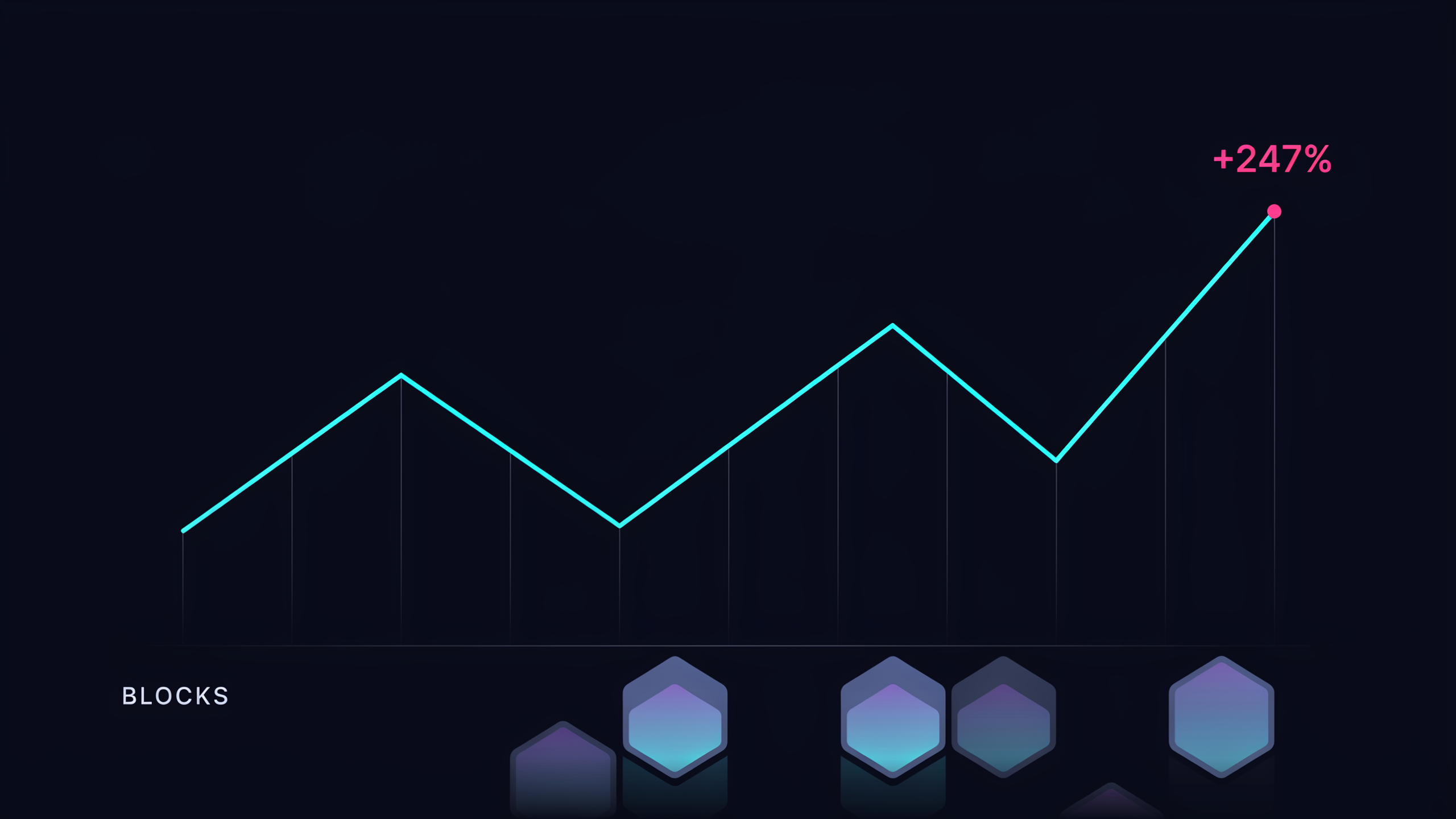
Price charts are the easiest part of crypto to screenshot and the hardest part to understand in isolation. A candle shows reaction. It does not explain cause. It tells readers where price went, but not necessarily why conviction changed, liquidity shifted or risk appetite returned.
That is why on-chain and structural analysis matter. Wallet flows, exchange balances, staking behavior, bridge usage, protocol revenue and liquidity migration can all reveal context that price alone cannot provide. None of these signals are perfect. Together, they make the story less flat.
A publication such as ChainReport can be useful when it treats the chain as evidence rather than decoration. The goal is not to drown readers in dashboards. The goal is to connect observable activity with market interpretation.
Too much crypto commentary starts with price and searches for a reason afterward. That creates neat stories, but not always accurate ones. A token may rally because liquidity is rotating, because supply is tight, because a narrative is spreading or because leverage is forcing a move. The headline may be only one ingredient.
Better analysis begins by accepting that markets are layered. There is the social layer, where narratives form. There is the market layer, where liquidity reacts. There is the protocol layer, where usage and incentives live. Strong coverage knows which layer it is discussing.
Charts will always matter because traders live with them. But the chain often tells the slower story underneath. Media that can read both will give audiences a better chance of understanding what the market is doing before the headline explains it too neatly.